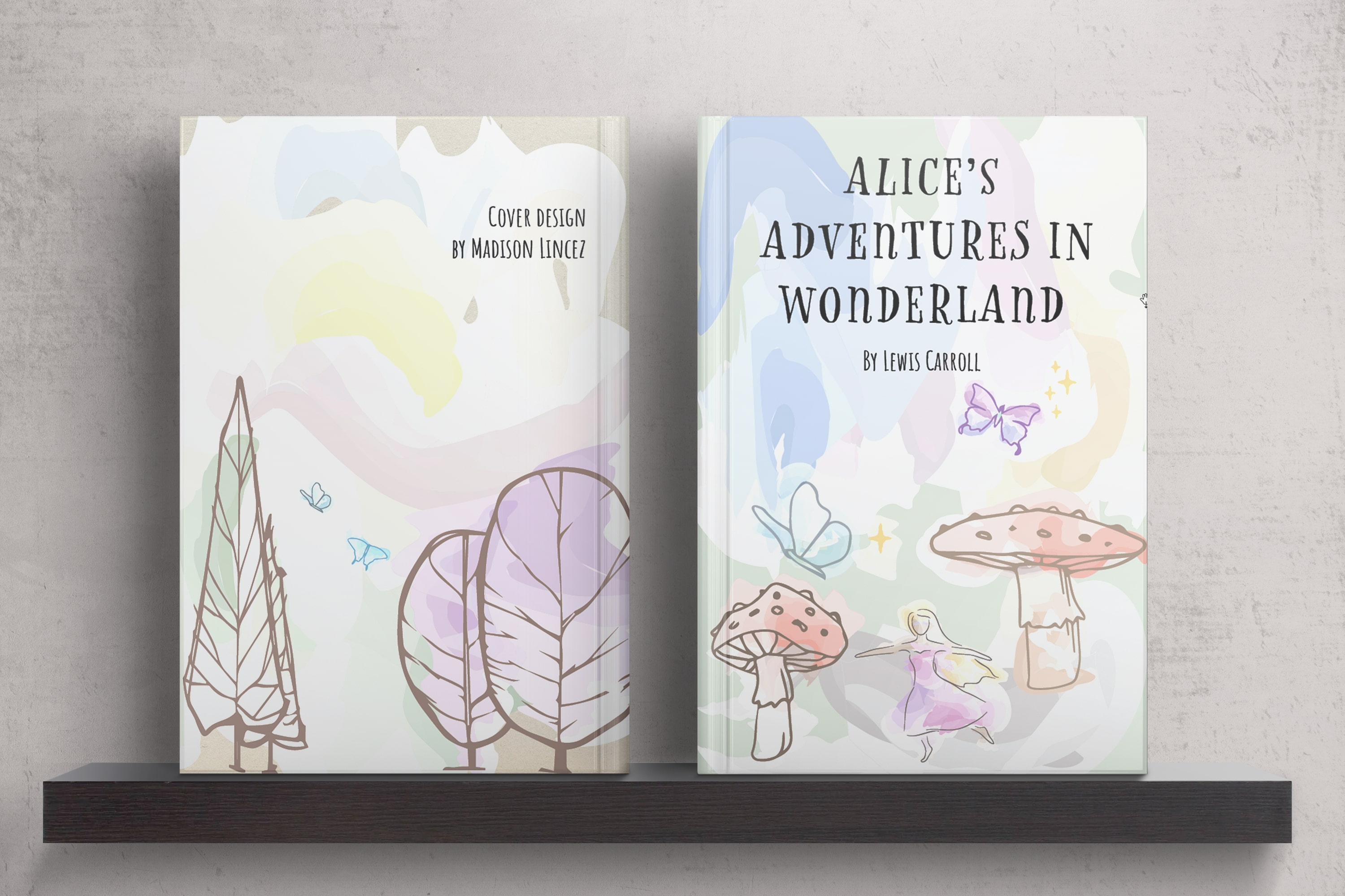
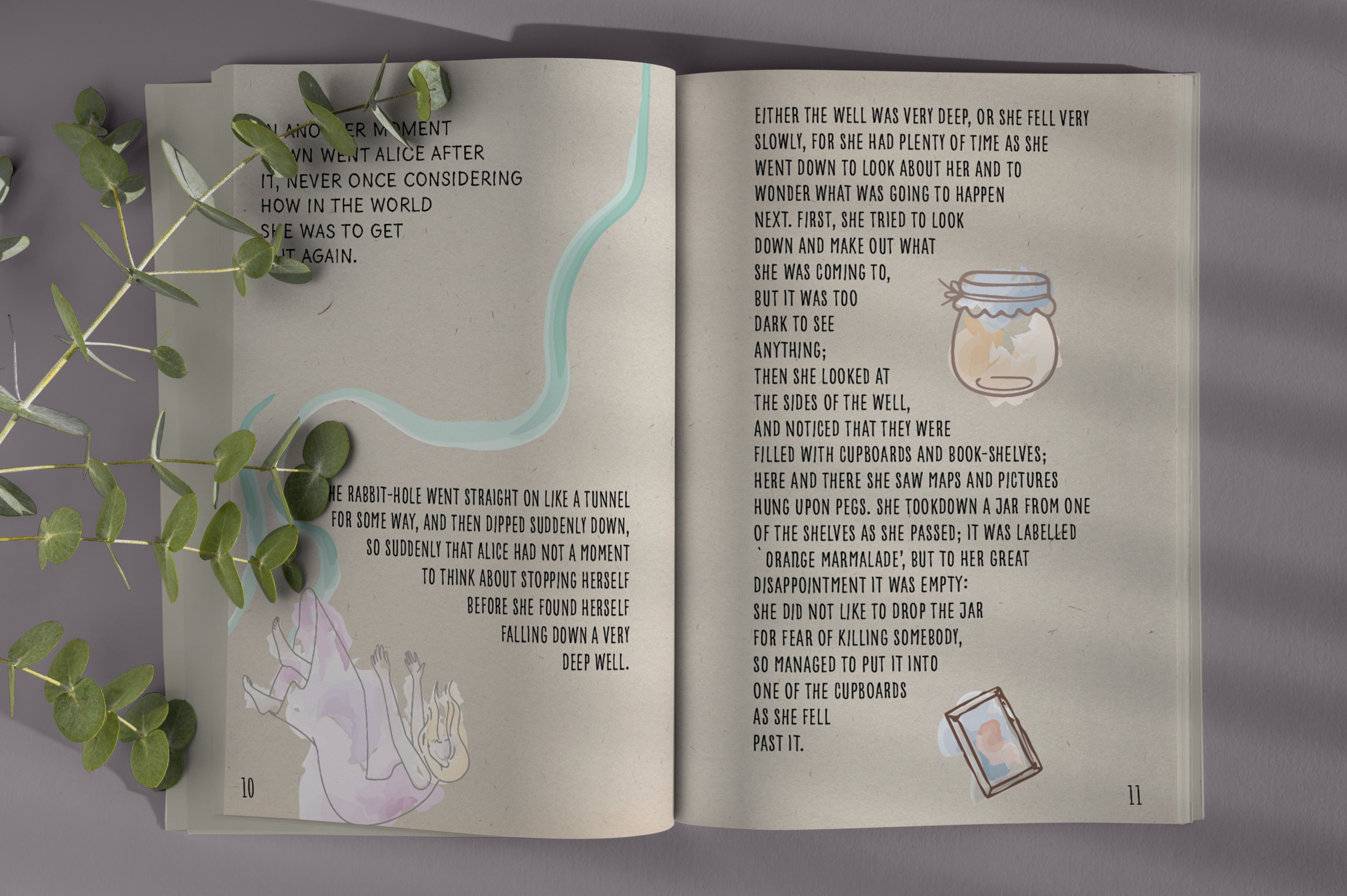
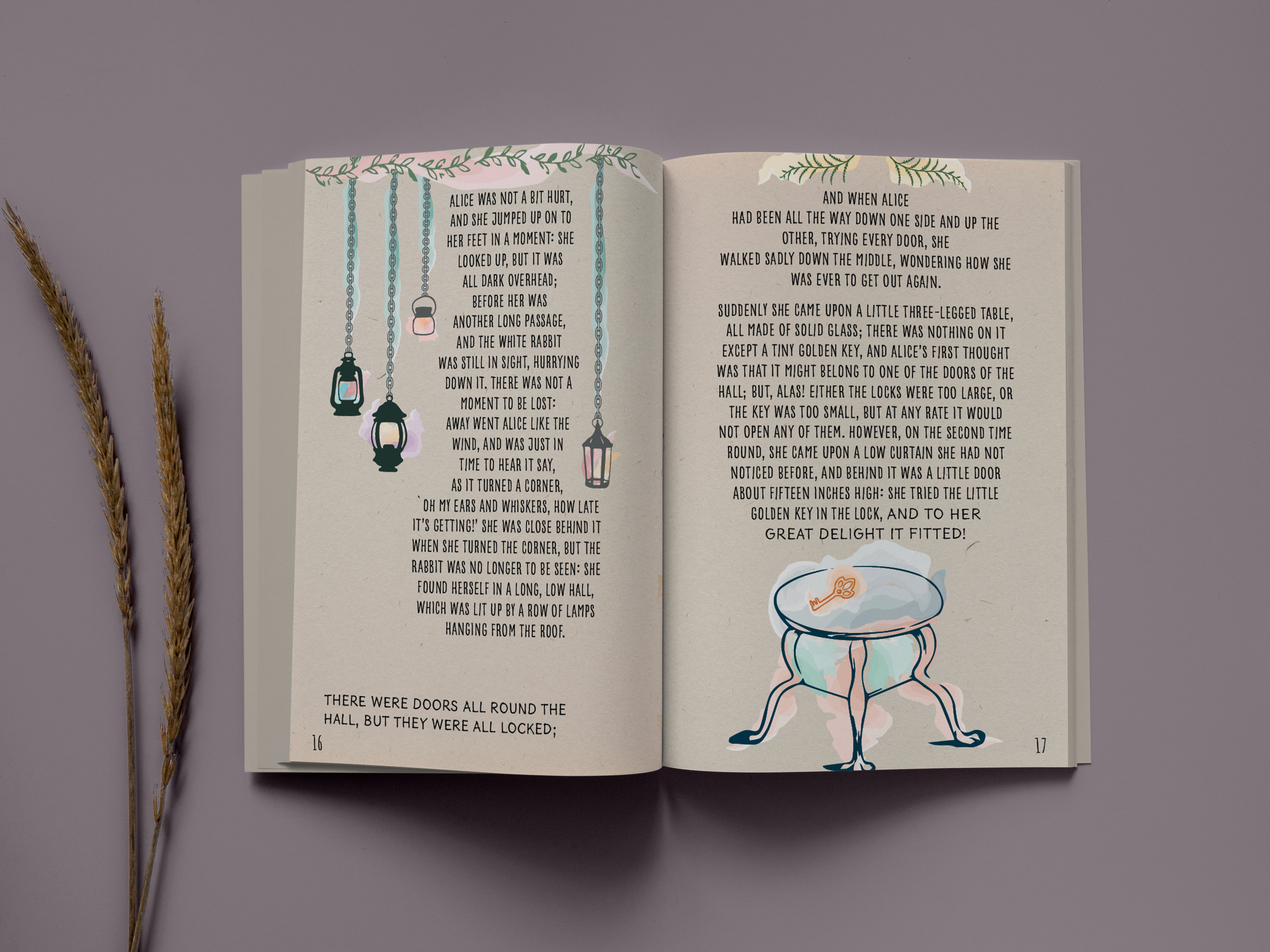
In reimagining the first chapter of 'Alice in Wonderland' for a limited edition design, the goal was to create an immersive experience that both honors the classic's whimsy and appeals to contemporary aesthetics. The project centered around the integration of bespoke illustrations with the narrative, carefully balancing the fluidity of text and art to ensure they complement rather than compete with each other. This approach was crucial in maintaining the story’s flow while drawing readers visually deeper into Alice's whimsical world.
The selection of typography played a pivotal role in echoing the playful yet adventurous spirit of the story. A font that was both playful and legible was meticulously chosen to enhance readability while contributing to the overall enchanting atmosphere of the book. This decision was complemented by the use of a vintage paper background, chosen to instill a sense of nostalgia, inviting readers of all ages to relive the wonder and exploration of youth through Alice's adventures.
Every design choice, from the illustrative style to the texture of the pages, was made with the intention of creating a cohesive reading experience that transcends mere visual appeal. The aim was to craft a book that not only captivates the imagination through its visual design but also resonates emotionally with readers, celebrating the timeless charm and narrative depth of 'Alice in Wonderland.' This design underscores a commitment to blending traditional storytelling with modern design principles to create a truly immersive and enduring literary experience.
Page Layout - Student Project
Madison Lincez
February 2023