ASK ME ANOTHER CANADA: BRANDING

Editorial | Marketing | Storytelling
Project Overview
The "Typography Talks" project aimed to rejuvenate Ask Me Another Canada's (AMAC) brand identity, melding modern design with rich Canadian heritage. The goal was to create a versatile, rebranded logo palette and a cohesive visual language that reflects AMAC's essence, employing a color palette that denotes sophistication, energy, and creativity. By incorporating Canadian cultural motifs and iconic elements into the design, the initiative sought to both honor AMAC's roots and appeal to a broad audience, ensuring the brand's dynamic spirit is consistently represented across all platforms.
My Contributions
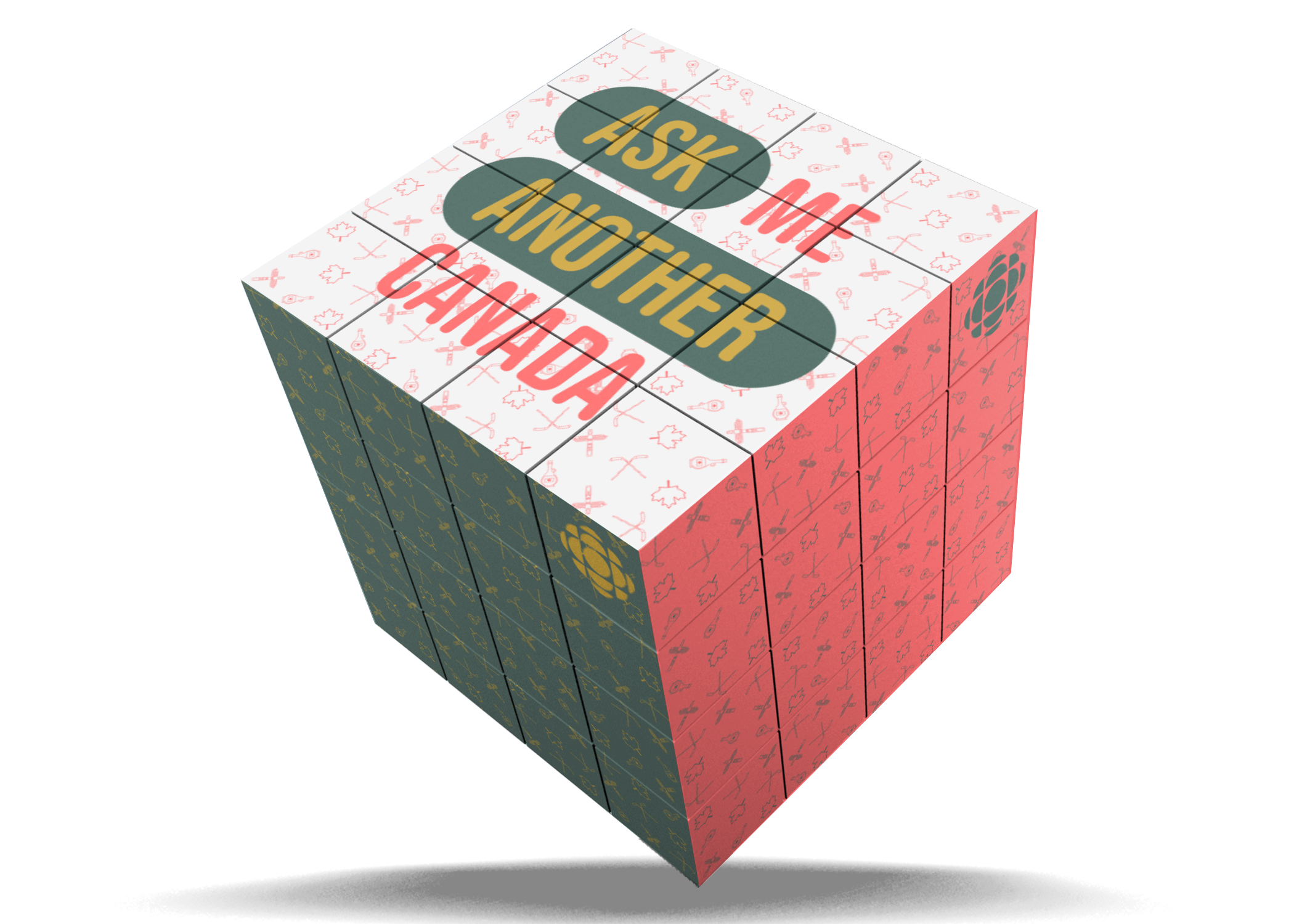
Logo Rebranding: Led the creative development of AMAC’s new logo colours, selecting a color palette of teal, yellow, and coral to encapsulate the brand’s modern flair while ensuring versatility for diverse applications.

Cultural Motif Integration: Strategically incorporated Canadian cultural motifs, including the iconic maple leaf, into the background pattern to pay homage to AMAC’s heritage and values, enriching the brand's identity with a sense of place and tradition.

Brand Identity Consistency: Ensured the new brand identity was adaptable and consistent across various platforms, reinforcing AMAC's dynamic spirit and broadening its appeal.

Visual Language Development: Crafted a distinctive visual language for AMAC through thoughtful design and typographic expertise, creating a vibrant, inclusive, and uniquely Canadian brand presentation.
In reimagining Ask Me Another Canada's (AMAC) identity, the design choices were deeply influenced by the desire to blend contemporary aesthetics with elements of Canadian heritage. The new logo, characterized by its modern flair, was carefully crafted using a palette of teal, yellow, and coral—colors chosen for their connotations of sophistication, energy, and creativity. This decision ensured the logo's adaptability across various mediums, providing a consistent visual identity that resonates with AMAC's dynamic and inclusive spirit.

The incorporation of Canadian cultural motifs, such as the iconic maple leaf, into the background pattern, serves more than an aesthetic function; it acts as a homage to AMAC's Canadian roots and core values. This subtle yet powerful integration of national symbols into the design narrative strengthens the brand's connection with the community and cements its place in the Canadian cultural landscape.

This design rationale reflects a holistic approach to branding, where every element—from color selection to motif integration—was chosen to tell AMAC's story. The goal was to create a visual language that is unmistakably AMAC—vibrant, inclusive, and distinctly Canadian, showcasing a brand identity that's not only visually appealing but also meaningful and resonant with its audience.
Identity Design - Student Project
Madison Lincez
August 2023