ART HOUSE IDENTITY

Branding | Communication | Conceptualization
Project Overview
The Art House project aimed to redefine the branding of a contemporary movie theater, setting it apart from traditional establishments. This initiative focused on establishing Art House as a beacon for vibrant social groups looking for an engaging, communal cinema experience. The project’s core was to create a brand identity that resonates with modern artistic expression, merging a captivating logo with a distinct word mark to anchor the brand's visual identity. Further enriching this identity, a custom branding pattern was crafted, reflecting the theater’s dedication to being a welcoming hub for movie lovers. Art House's identity promises a fresh perspective on cinema, emphasizing comfort, connection, and the celebration of film.
My Contributions
Brand Development: Played a key role in developing the overarching brand identity, ensuring it communicated the modern,
artistic ethos of Art House.

Logo and Word Mark Design: Contributed to the design of a striking logo and memorable word mark, working closely with the design team to encapsulate the essence of Art House.

Branding Pattern Creation: Assisted in the creation of a bespoke branding pattern, embodying the theater's unique character and its commitment to fostering a social, welcoming
environment for film aficionados.
Identity Design - Student Project
Madison Lincez
May 2023
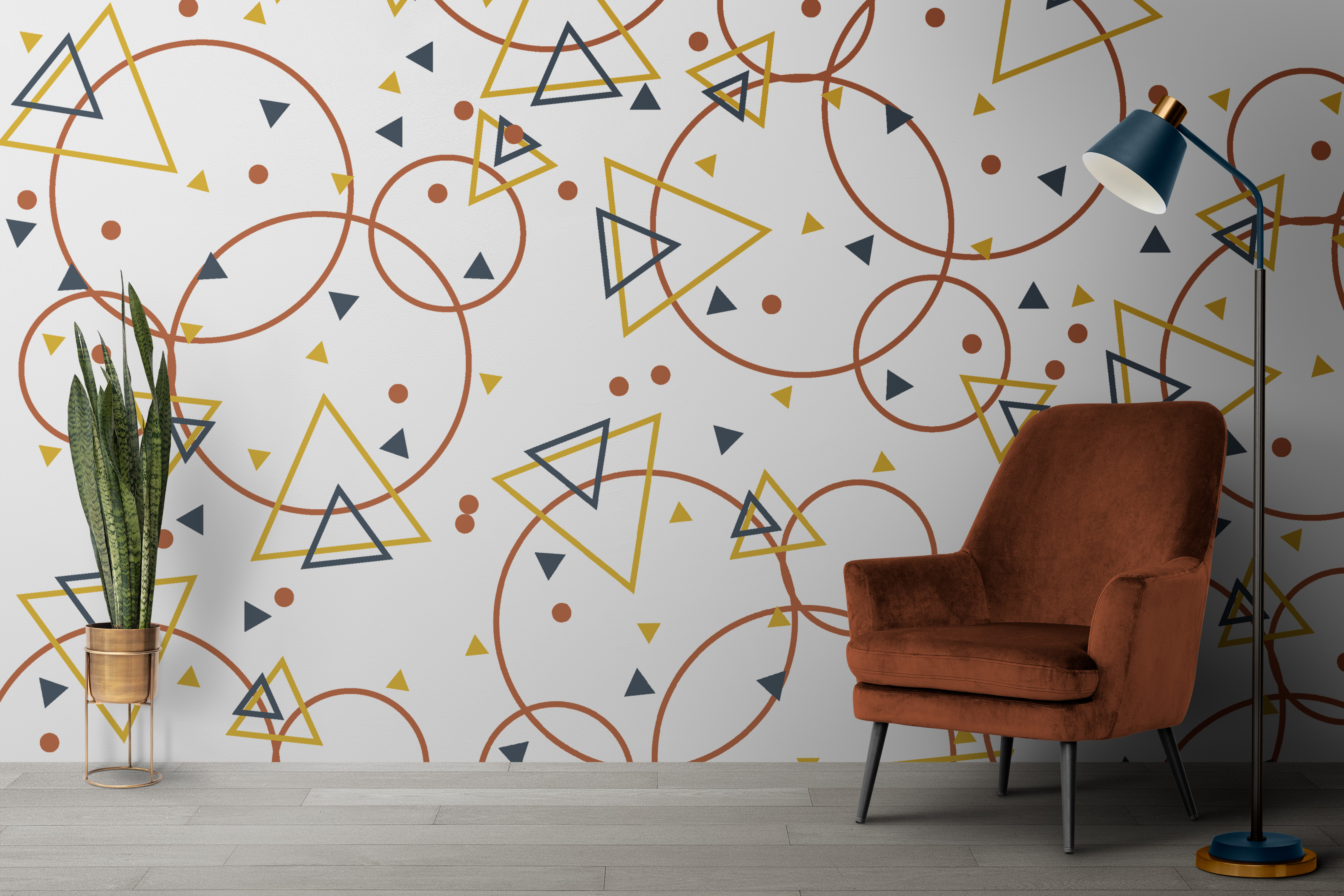
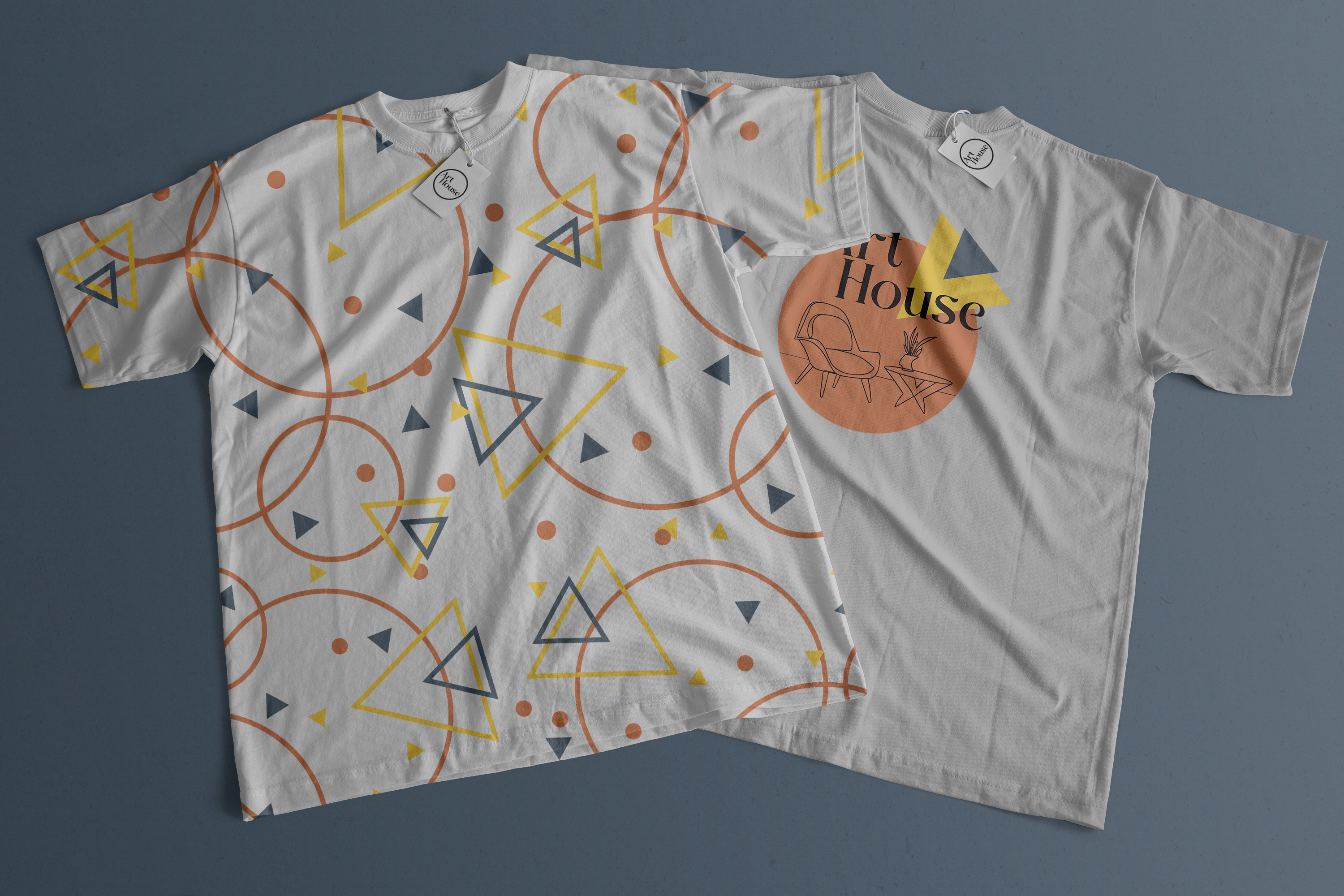
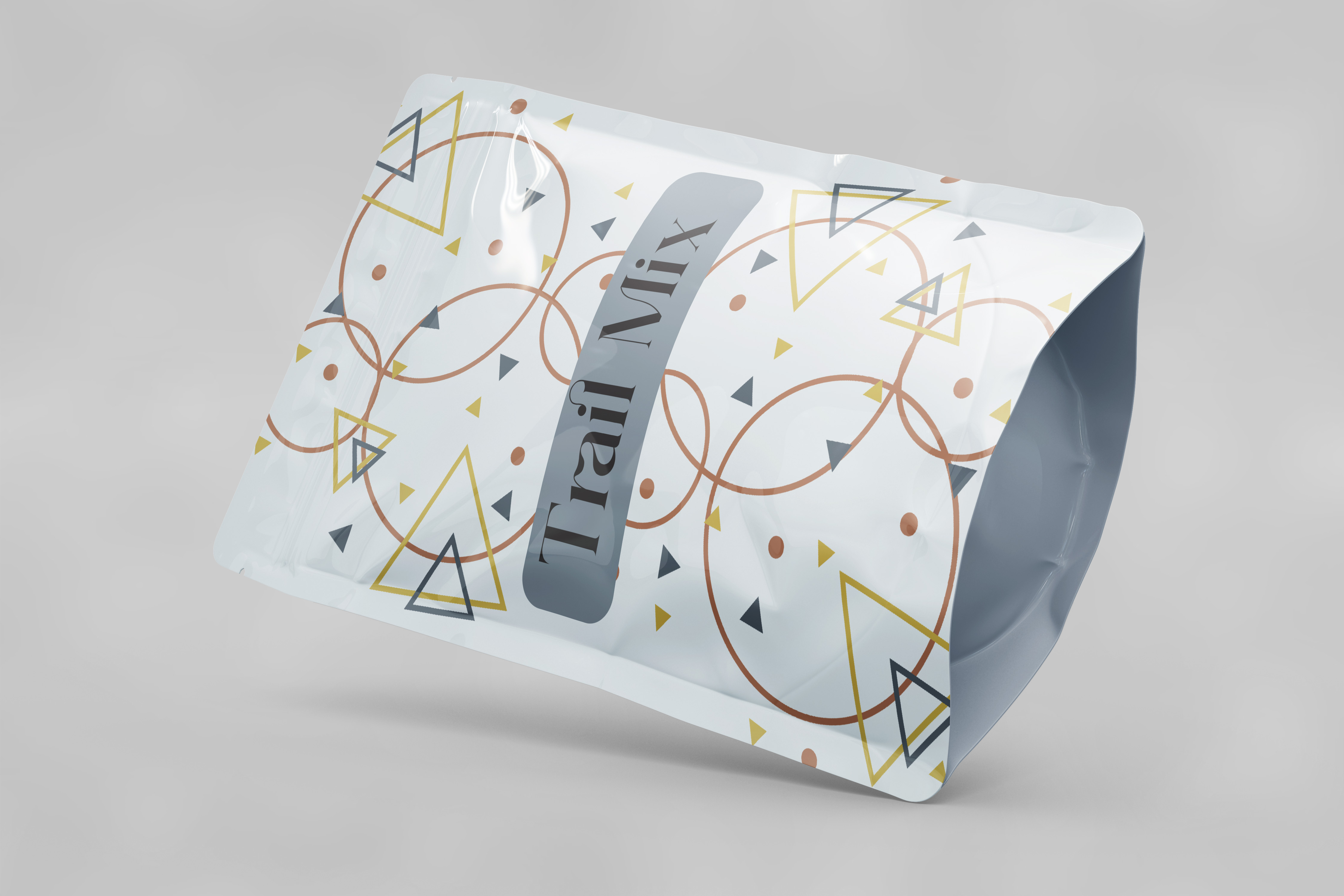
In creating the brand identity for Art House, extensive research and brainstorming led to a design philosophy centered on geometrical simplicity and uniqueness. The emblem, a harmonious blend of geometric shapes, was inspired by insights provided by the client, symbolizing unity, creativity, and the cinematic experience. The use of a circle reflects community and pays homage to classic film reels, while a composition of triangles suggests the dynamic interplay of light and imagination intrinsic to storytelling.

A minimalistic armchair within this geometric narrative not only differentiates Art House from traditional theaters but also emphasizes comfort and the social aspect of cinema-going. The choice of a nuanced color palette and typeface further refines the brand’s visual language, with pale orange, yellow, and a greyish blue complementing each other to evoke creativity, passion, and tranquility.

This careful selection, alongside a graphic pattern that playfully reiterates the logo’s elements across various applications, encapsulates Art House's ethos. The resulting design is a testament to a space that celebrates film in an environment that is as inviting and vibrant as the stories on screen, promising a unique cinematic experience.