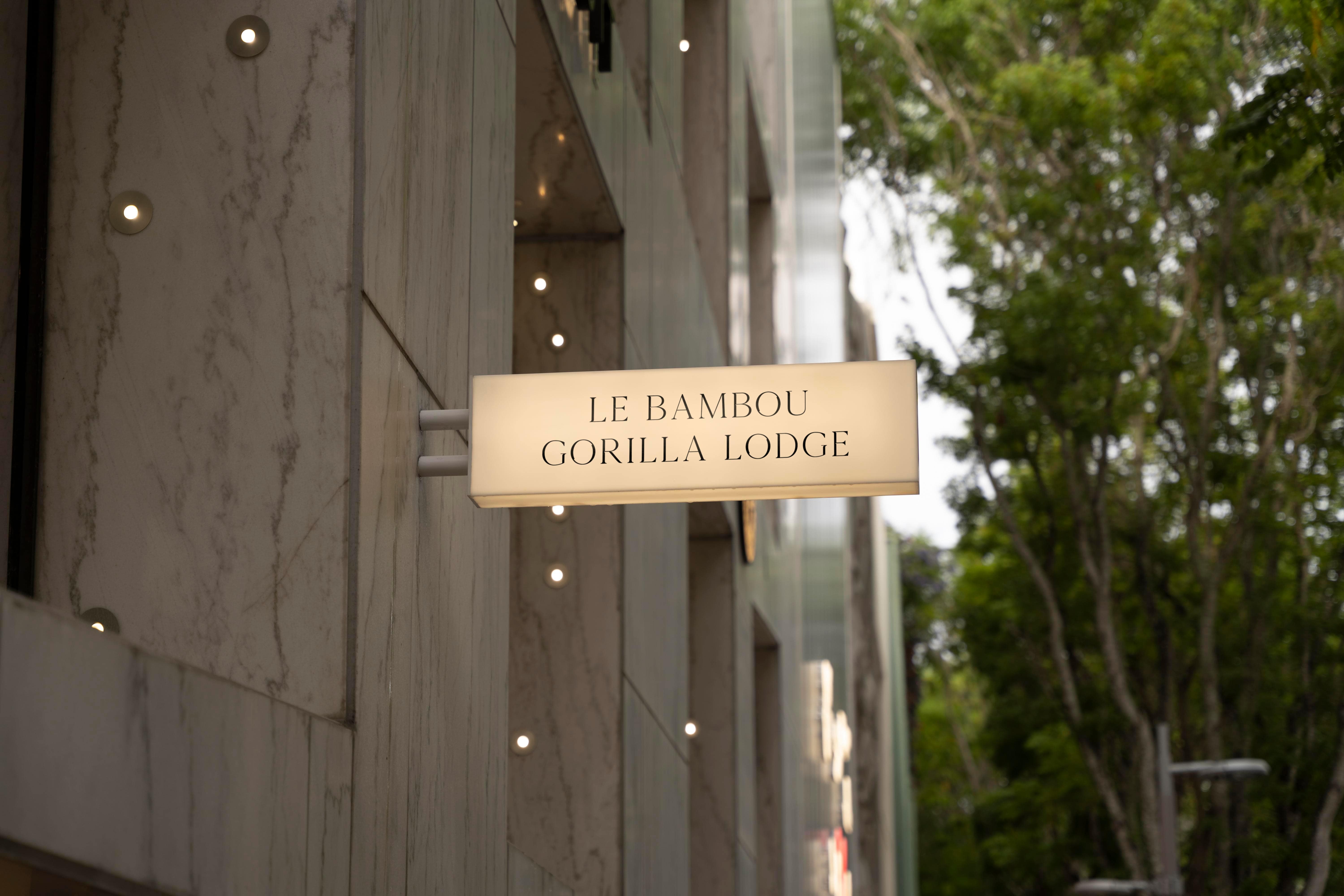
The revitalization of the hotel's brand and online presence was strategically approached with a clear objective: to modernize the hotel's image while enhancing user engagement on their website. Initial discussions with the client helped to outline design preferences and essential elements, setting the stage for a collaborative ideation process. Preliminary sketches laid the groundwork for the website's layout, emphasizing functionality and aesthetics in equal measure.
The website was built using Web Flow, focusing first on essential components like the navbar, utilizing a grid system for a responsive and harmonious layout across devices. Special attention was given to user experience features, such as accordion functionality for efficient navigation and a dedicated call-to-action for bookings. Testimonials were presented using a grid layout to enrich the site with genuine guest experiences, and a carefully structured footer included both contact information and social media links, ensuring a comprehensive yet uncluttered user interface.
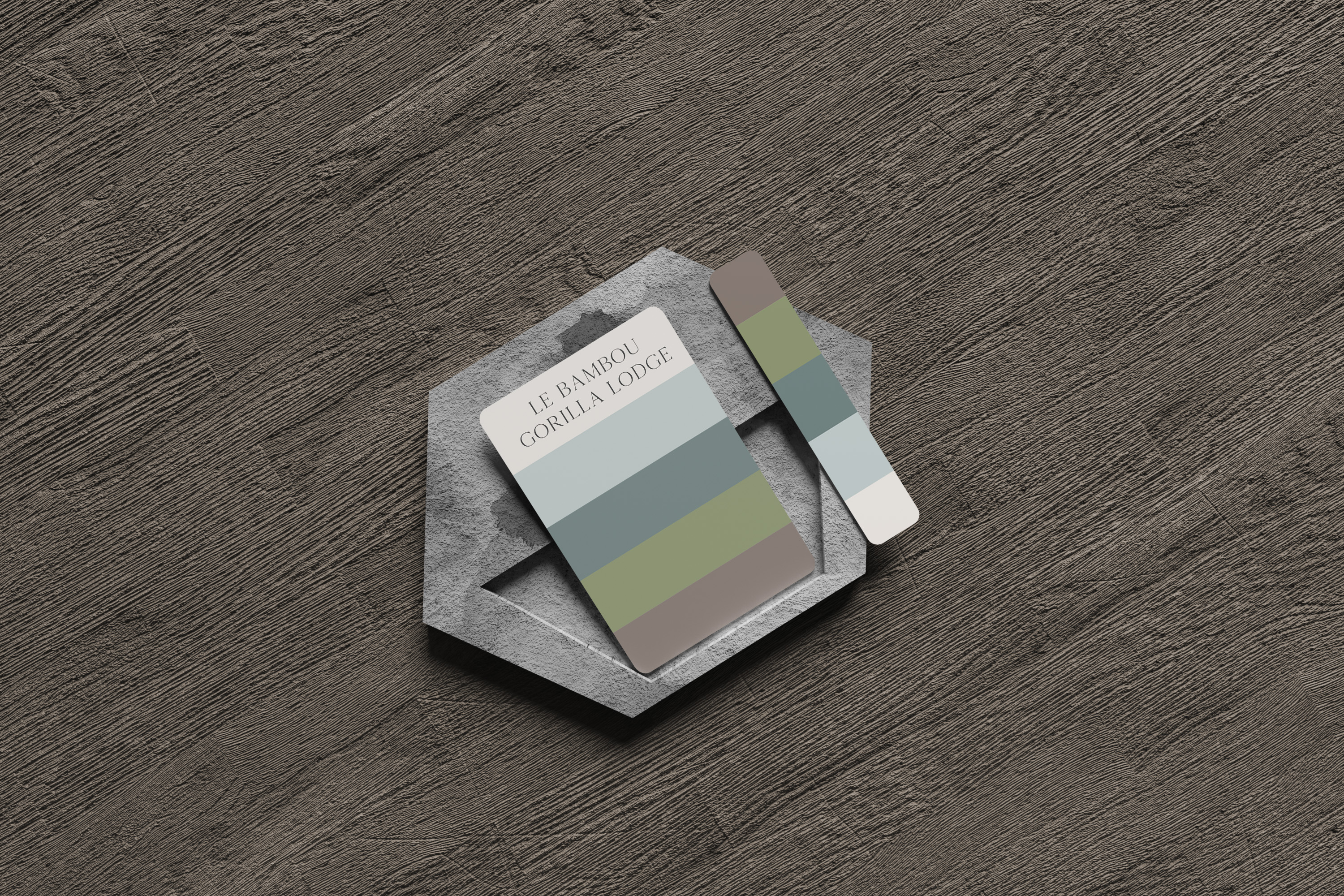
The chosen color palette and design elements aimed to reflect the hotel's setting and ethos, using earthy tones and a clean, navigable layout to invoke the area's natural beauty and the hotel's commitment to a serene guest experience. This design rationale underscores a meticulous process of translating the hotel's identity into a digital format, aiming for a balance between aesthetic appeal and practical usability, ultimately crafting an online presence that mirrors the warmth and authenticity of the hotel itself.
Hotel Brand Revitalization - Professional Commission
Madison Lincez
June 2023


