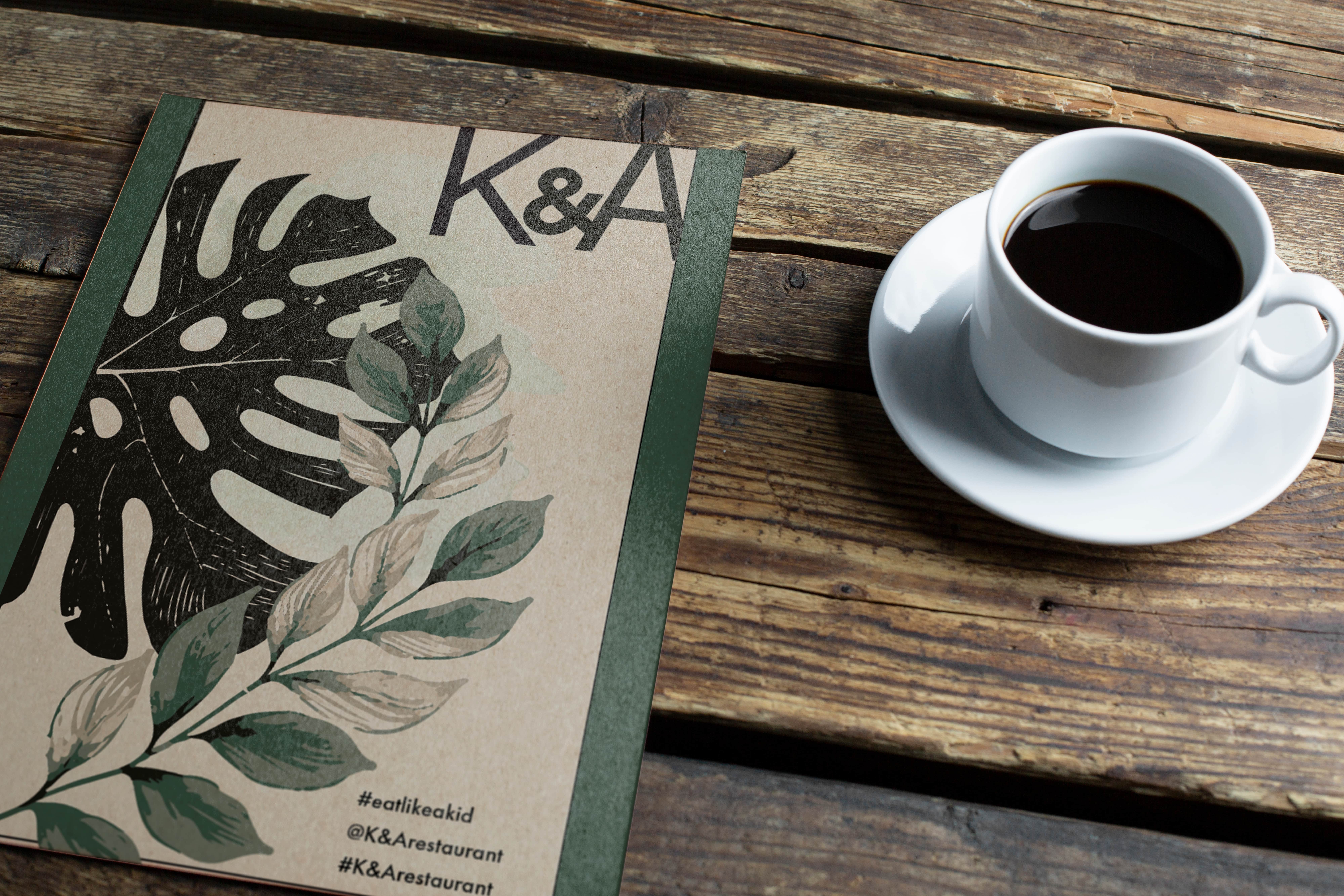
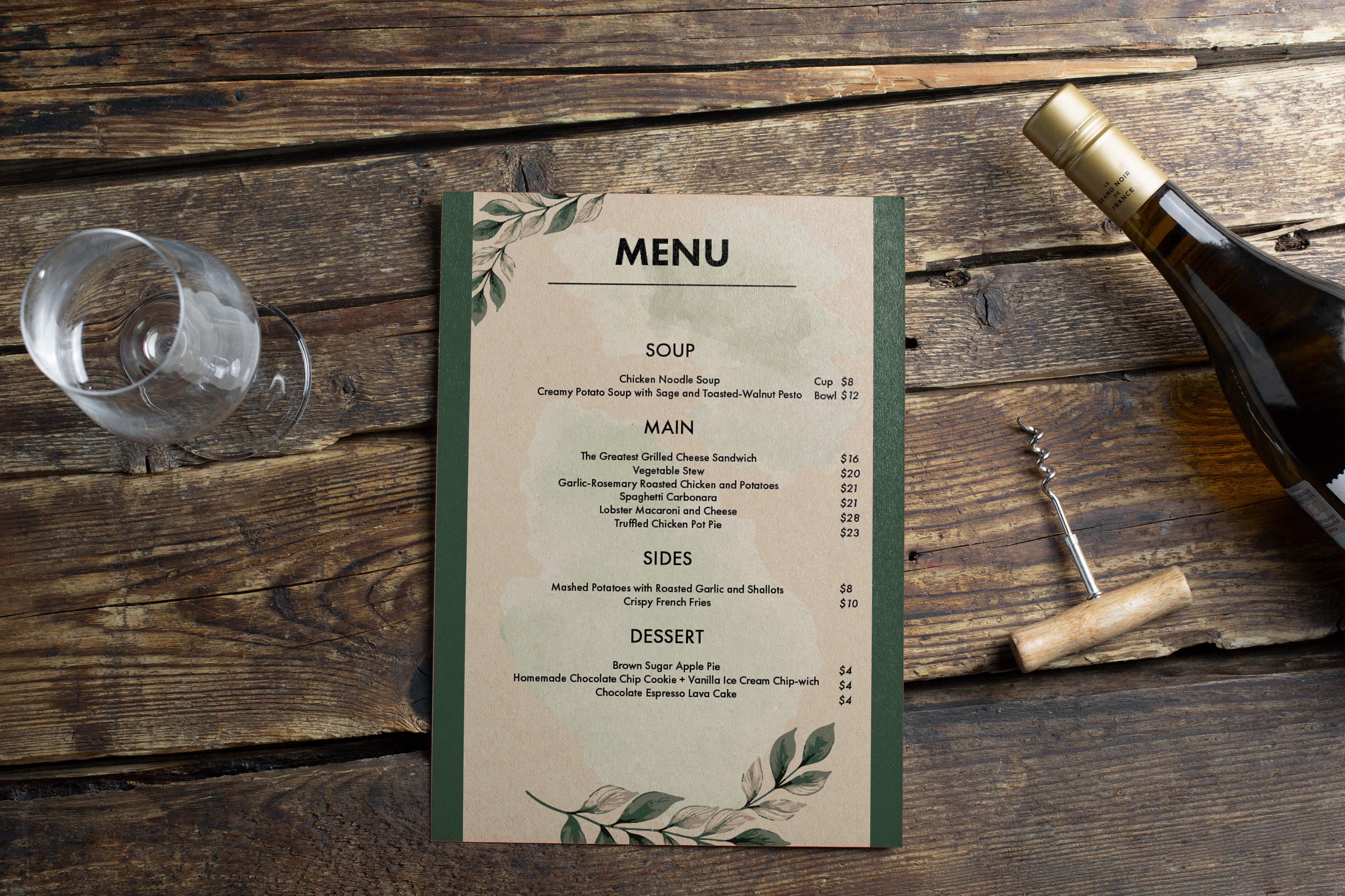
The K&A Menu design project was guided by a minimalist philosophy, targeting a sophisticated adult audience with a refined palate for both food and visual aesthetics. The decision to employ a minimalist approach was not merely stylistic but strategic, aiming to simplify the dining experience while highlighting the restaurant's culinary offerings without overwhelming the diner. This simplicity was balanced with elegance, achieved through the careful selection of fonts and a color scheme that speaks to modernity yet retains warmth, inviting diners into a narrative of taste and discovery.
A nostalgic touch was introduced through the choice of background, reminiscent of handwritten recipe cards. This design choice serves to evoke a sense of warmth and personal connection, bridging the gap between traditional culinary arts and contemporary dining experiences. The incorporation of monstera leaf graphics further reflects the restaurant's dedication to freshness and quality, infusing the menu with a lively, botanical flair that complements the overall aesthetic and reinforces the theme of natural ingredients and vibrant flavors.
Strategically organized menu sections and the integration of social media prompts were implemented to enhance the diner's journey through the menu and foster a sense of community and shared culinary adventure. By encouraging guests to connect and share their experiences, the menu extends beyond a simple listing of dishes to become a tool for engagement, reflecting the communal joy of dining. This comprehensive approach to menu design showcases an understanding of how form and content can coalesce to create not just a functional document, but a memorable part of the dining experience.
Page Layout - Student Project
Madison Lincez
November 2022


