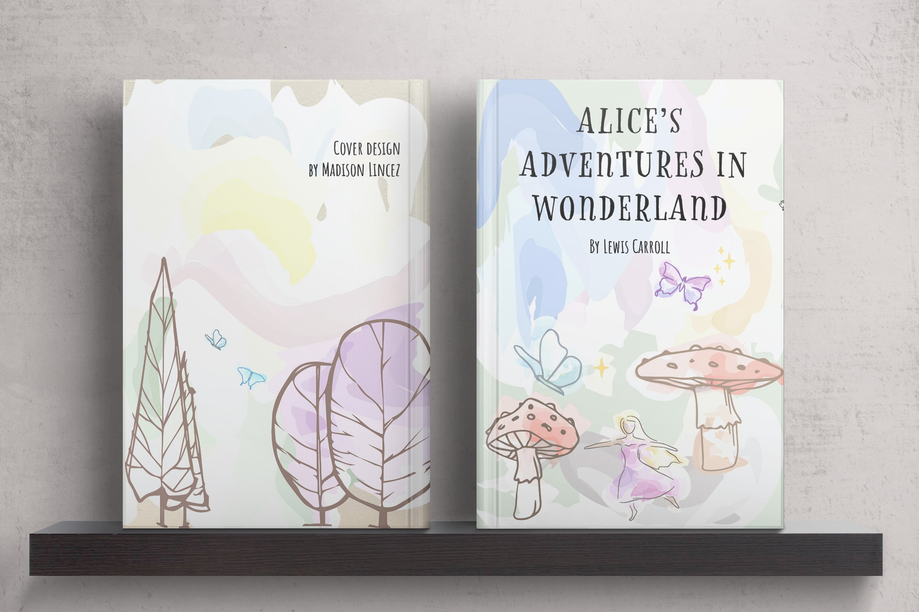
Alice in Wonderland — Limited Edition
Toronto Film SchoolProject Overview
A limited edition of Alice's Adventures in Wonderland, built around the first chapter. I designed the book and drew the illustrations, so layout and image were worked out together rather than handed off.
The reader is a young adult who wants whimsy with some earth in it. The object should feel like opening a keepsake, not a textbook.
My Contributions
Illustration: Drew each piece by hand through a Cottagecore lens, botanical and soft rather than cute, then refined it digitally so it could sit next to type.
Typography: Chose type that echoes the story's adventure without turning into costume lettering, and kept it readable at text size.
Layout: Balanced margins and image scale so art and text share the page as equals, with vines and margins carrying the spread instead of borders.
Design Notes
Designing both halves meant the illustrations could be drawn to the grid. Vines wrap the text block rather than sitting on top of it, and the cover keeps Alice curious without giving the chapter away.
A vintage paper ground adds nostalgia and a little tooth. It sits behind the type, not over it, so the page reads as held rather than distressed.