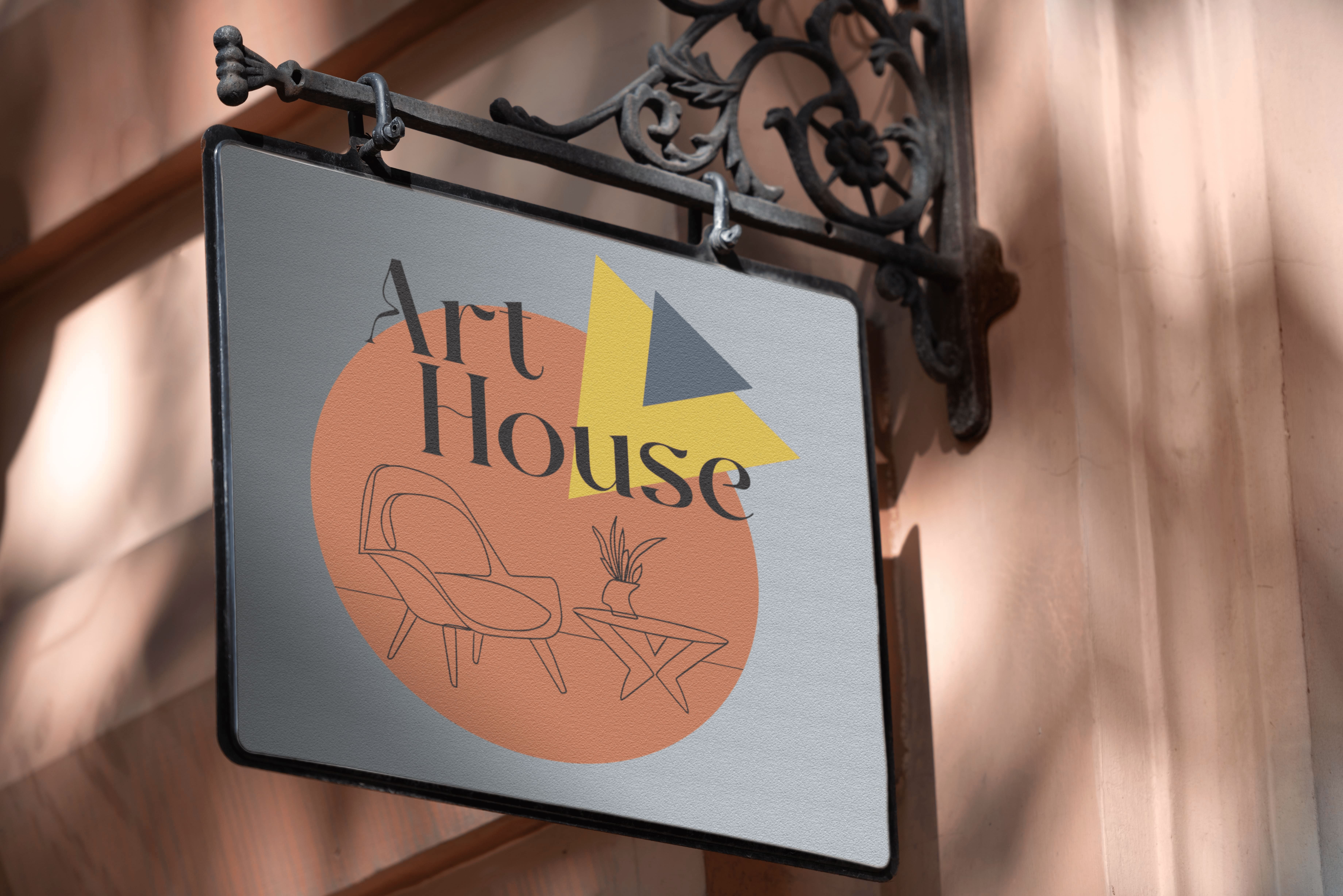
Art House Identity Design
Toronto Film SchoolProject Overview
Art House needed to feel like a contemporary cinema, not a multiplex. The brief was a modern, artistic identity that makes film-going feel communal: a mark, a wordmark, and a pattern that can live on the building, the merch, and the concessions.
The system is built on geometric simplicity so the brand stays recognizable at every scale, from a lounge wall to a popcorn box.
My Contributions
Research: Looked at independent cinemas and classic film graphics to find a language that felt artistic without turning precious.
Ideation: Explored circle and triangle constructions, then a minimal armchair that signals comfort instead of a film-reel cliché.
Design: Built the emblem, wordmark, and a repeating pattern from the same geometry so applications stay in family.
Refinement: Tuned the pale orange, yellow, and grey-blue palette until it felt creative and calm, not loud.
Outcome: A flexible identity ready for interiors, apparel, and packaging.
Design Notes
The emblem pairs a circle, a nod to community and classic reels, with triangles that suggest projected light. A small armchair inside the mark sets Art House apart from traditional theaters.
The pattern repeats those shapes so the brand can wrap a room or a t-shirt without needing a new graphic each time. Colour stays warm and restrained: pale orange and yellow for energy, grey-blue for quiet.