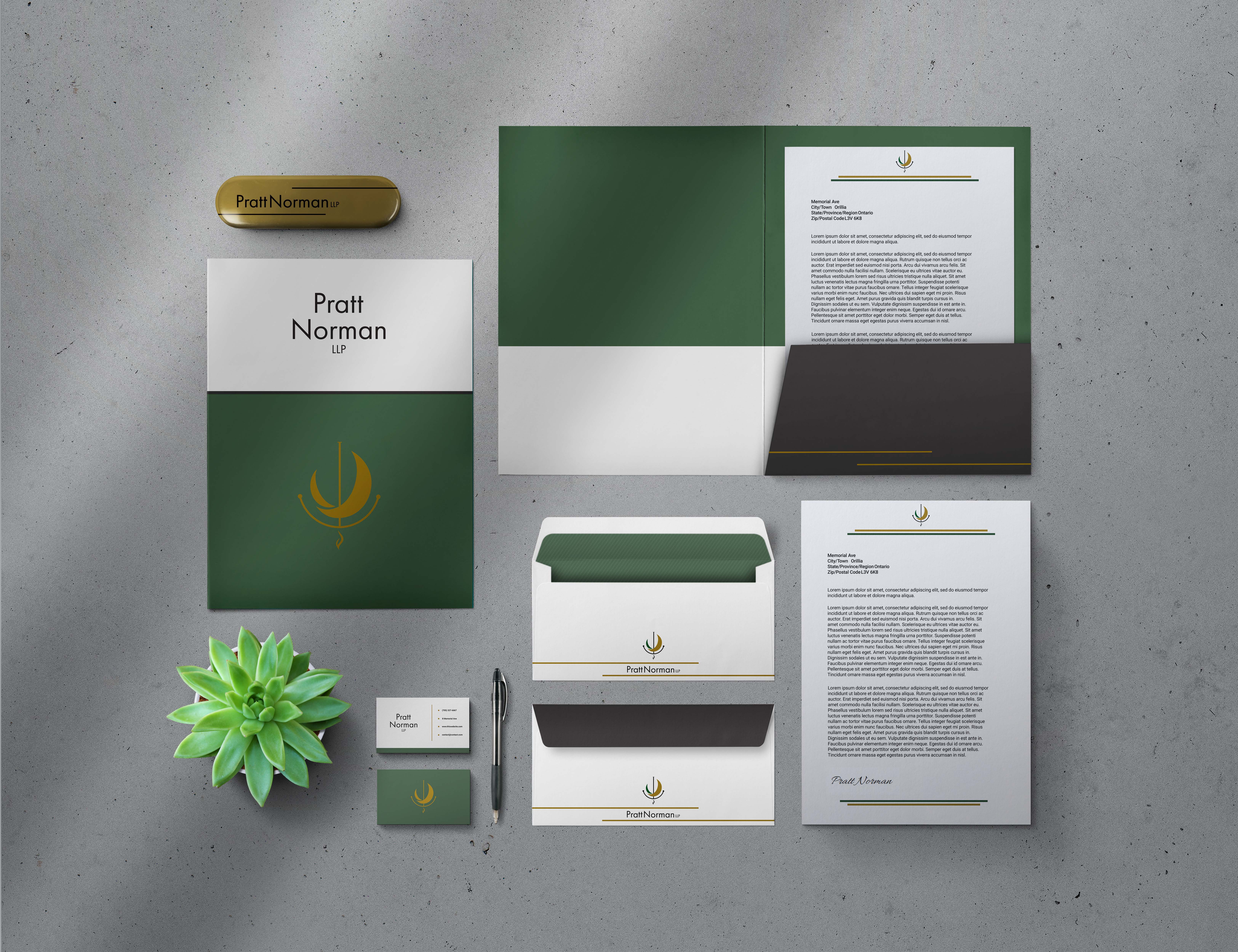
Pratt Norman LLP Identity
Toronto Film SchoolProject Overview
Pratt Norman LLP is a boutique entertainment and media law practice representing film, television, theatre, and interactive media clients across North America. The rebrand had to look precise enough for a firm and still admit a connection to the arts: hard-working, smart, modern, and stylish in one mark.
The system covers logo, colour, typography, and applications from stationery to signage, plus a website designed and built in Webflow.
My Contributions
Research: Looked at how entertainment-law firms present themselves, and where they either freeze into corporate or lean too theatrical.
Ideation: Developed three concepts with full rationales: a mountain peak in a circle for ambition, the P and N initials confined in a square for creative solutions within legal boundaries, and quill-like half-moons over a small flame.
Design: Took the quill-and-flame direction forward with geometric construction, vertical and horizontal lockups, and a palette of deep green, gold, grey, and black.
Documentation: Wrote the identity usage guide: logo construction, clear space, minimum sizes, background rules, and a 60-30-10 colour proportion system.
Web: Designed the firm's website in Webflow with custom expertise icons, team photography direction, and the brand carried through every page.
Outcome: A modern identity that reads as both counsel and advocate for creative work.
Design Notes
The mark pairs two quill-like half-moons — tradition, expertise, and the paper trail of legal practice — with a small flame for the creativity and dynamic nature of the entertainment industry. Thin, minimal lines keep it precise and versatile across platforms.
Deep green for trust and growth, gold for wisdom and success, grey for professionalism, black for authority. Typography runs on Roboto for headings and body, Merriweather for subheadings and pull quotes, and Lato for captions — modern, but with a formal serif where it counts.